heights_weights_gender <- read.table("https://raw.githubusercontent.com/johnmyleswhite/ML_for_Hackers/refs/heads/master/02-Exploration/data/01_heights_weights_genders.csv", header=T, sep=",")14 More plot types
Scatter plots of data
Here we download a real dataset of height and weights of 5000 men and 5000 women.
read.table() can directly read from a URL:
The head of the dataset:
head(heights_weights_gender) Gender Height Weight
1 Male 73.84702 241.8936
2 Male 68.78190 162.3105
3 Male 74.11011 212.7409
4 Male 71.73098 220.0425
5 Male 69.88180 206.3498
6 Male 67.25302 152.2122Separate data for men and women, plot the data for men only:
men <- heights_weights_gender$Gender == "Male"
men_heights <- heights_weights_gender[["Height"]][men]
men_weights <- heights_weights_gender[["Weight"]][men]
plot(men_heights, men_weights)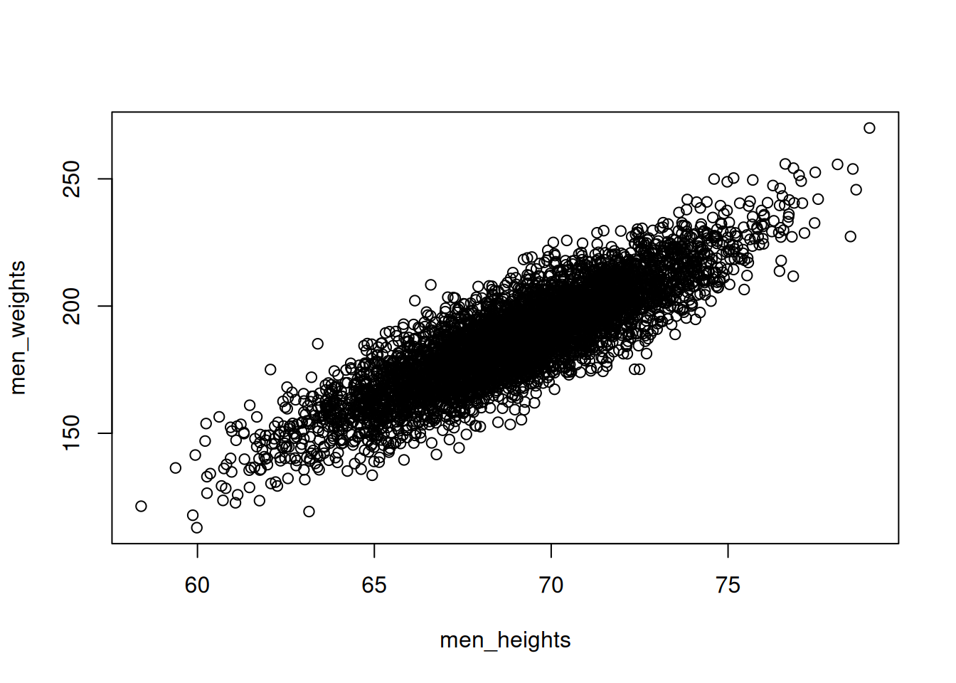
Change the axis labels and add a plot title
plot(men_heights, men_weights,
     xlab = "Height [inches]",
     ylab="Weight [pounds]",
     main="Weight vs height for men")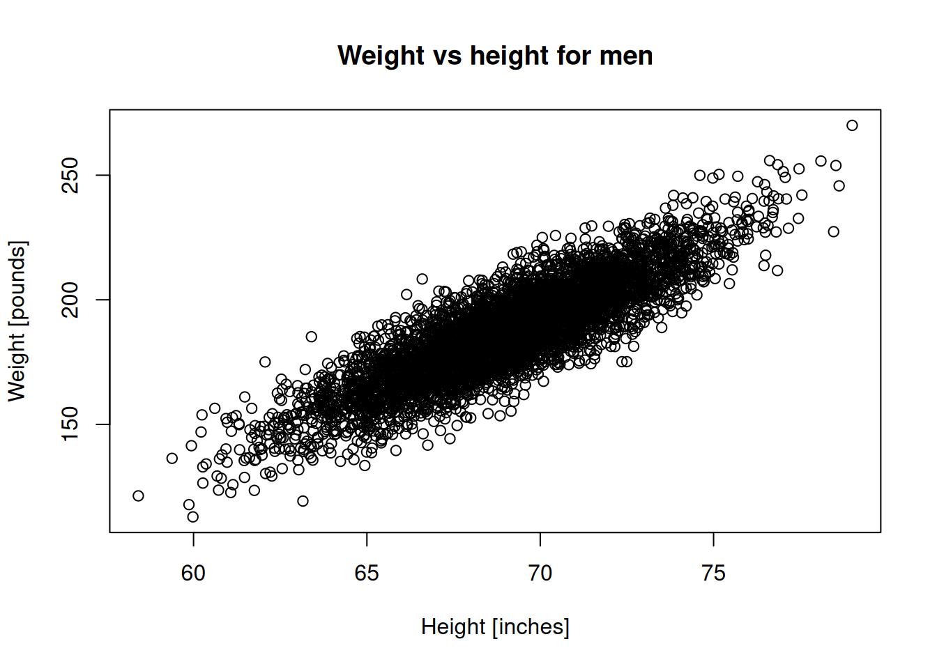
Change the marker type and color:
plot(men_heights, men_weights,
     pch=4,
     col="blue",
     xlab = "Height [inches]",
     ylab="Weight [pounds]")
title("Weight vs height for men")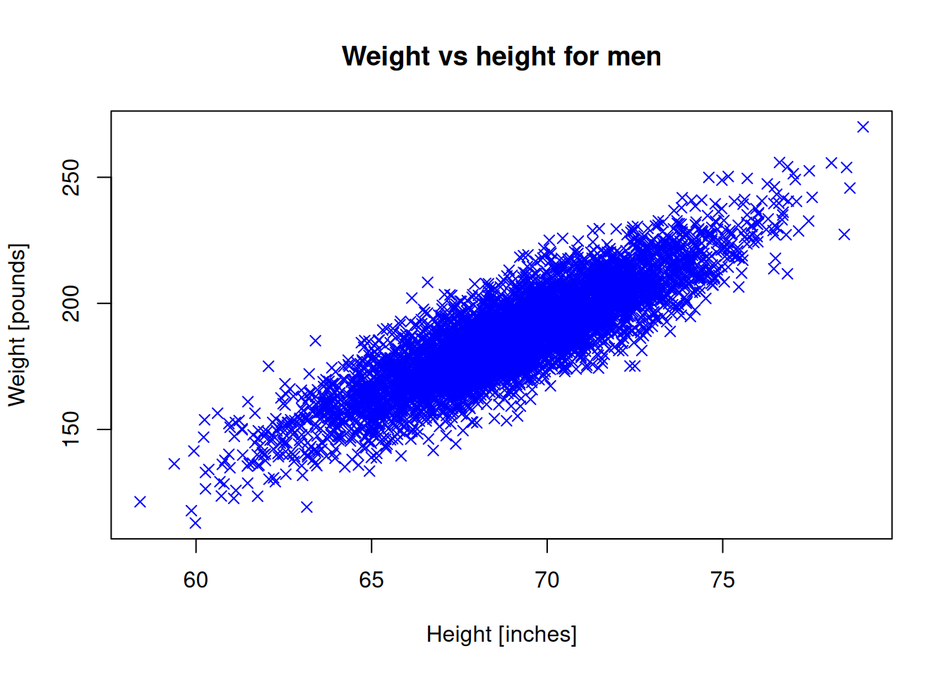
Do the same for women:
women <- heights_weights_gender$Gender == "Female"
women_heights <- heights_weights_gender[["Height"]][women]
women_weights <- heights_weights_gender[["Weight"]][women]plot(women_heights, women_weights,
pch=20,
col="red",
xlab = "Height [inches]",
ylab="Weight [pounds]")
title("Weight vs height for women")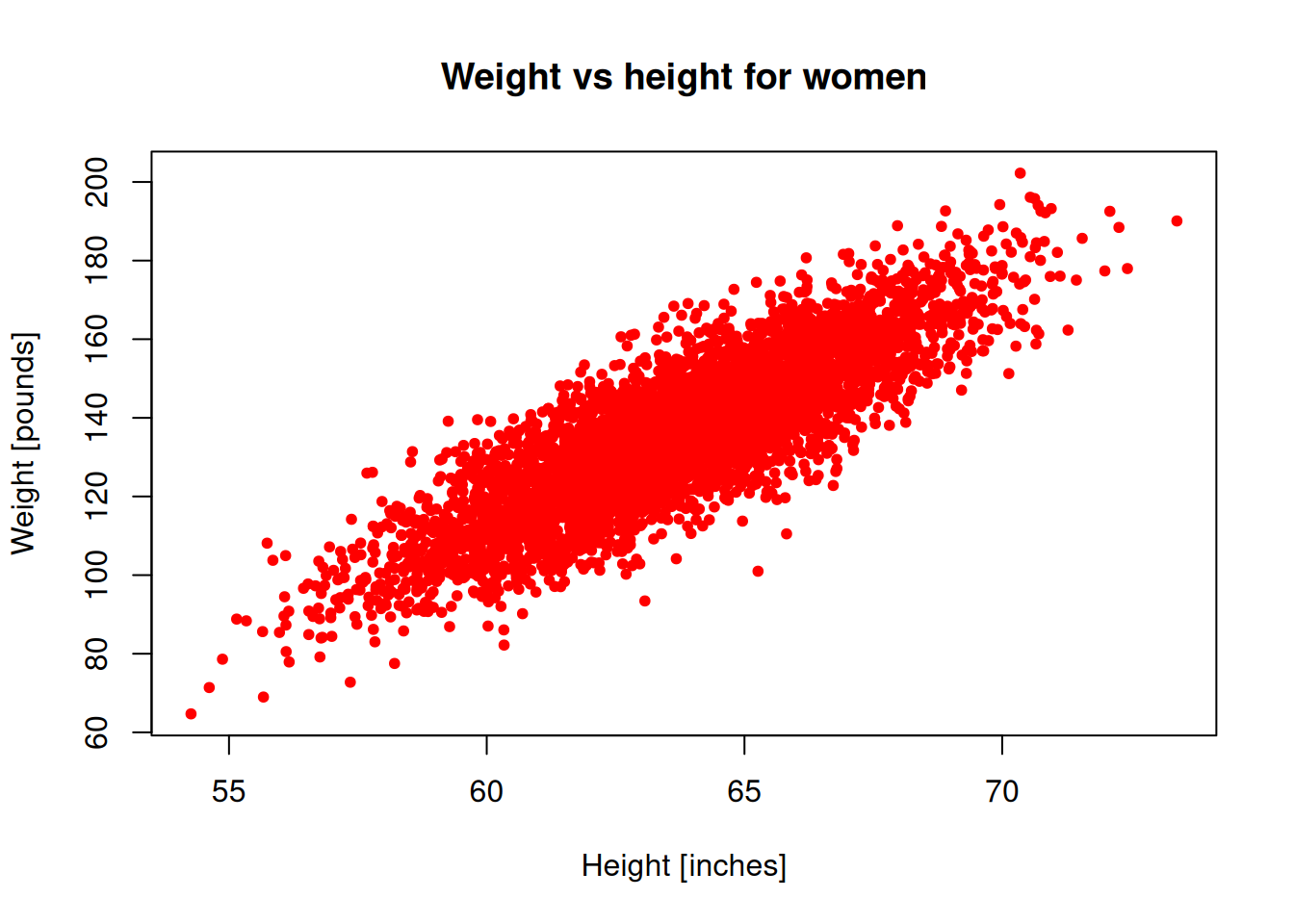
Let’s try to show both genders on the same plot.
Note: In order to add a new scatter plot on an existing plot, we need to use the points() function.
plot(men_heights, men_weights, pch=4, col="blue",
    xlab = "Height [inches]", ylab="Weight [pounds]")
points(women_heights, women_weights, pch=20,
        col="red", xlab = "Height [inches]",
        ylab="Weight [pounds]")
title("Weight vs height of adults")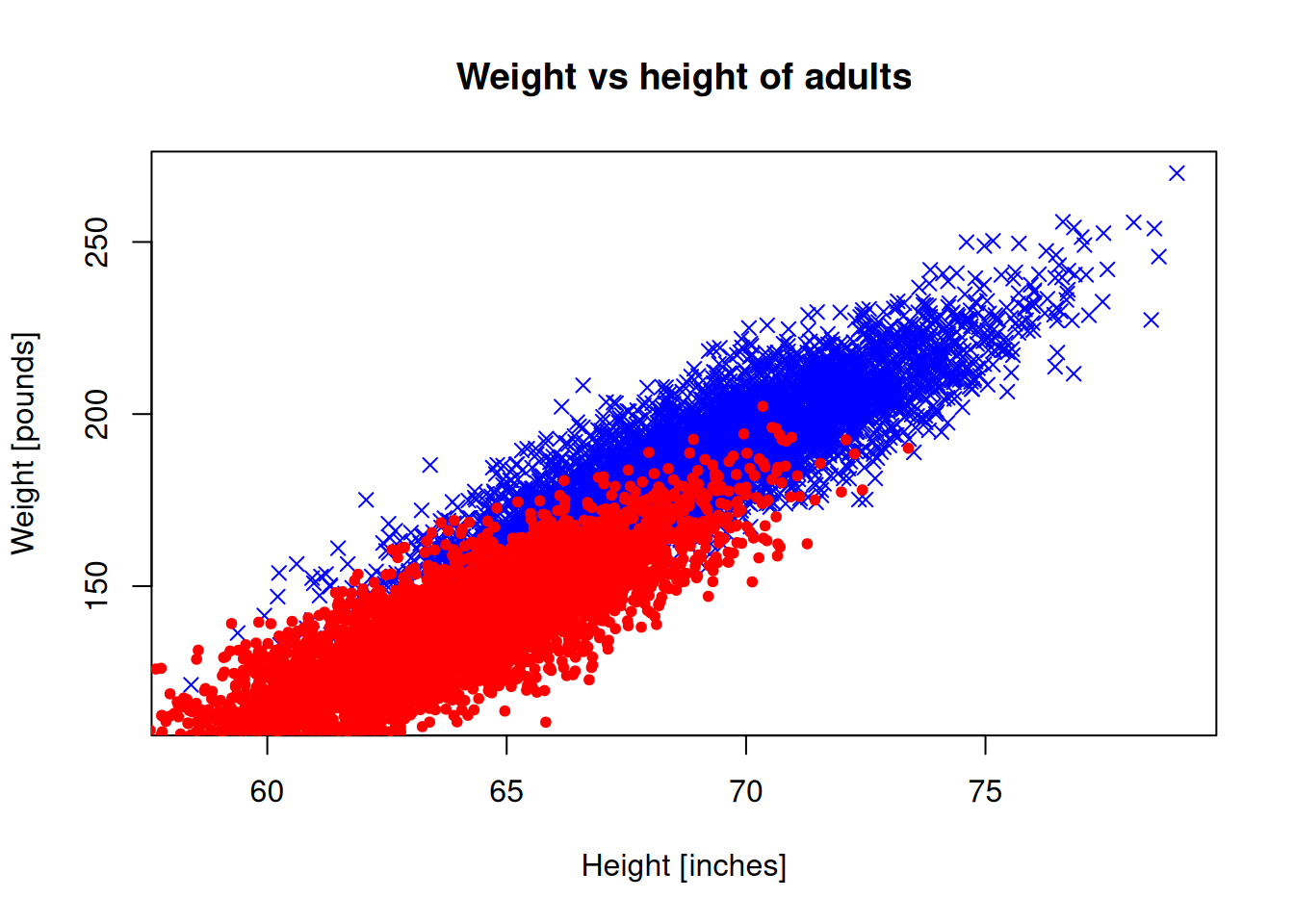
The plot limits don’t look right, because they are automatically set for the male data. Let’s set the limits manually:
plot(men_heights, men_weights, pch=4, col="blue",
     xlab = "Height [inches]", ylab="Weight [pounds]",
     xlim = c(50,80), ylim = c(60,270))
points(women_heights, women_weights, pch=20, col="red",
       xlab = "Height [inches]", ylab="Weight [pounds]",
       xlim = c(50,80), ylim = c(60,270))
title("Weight vs height of adults")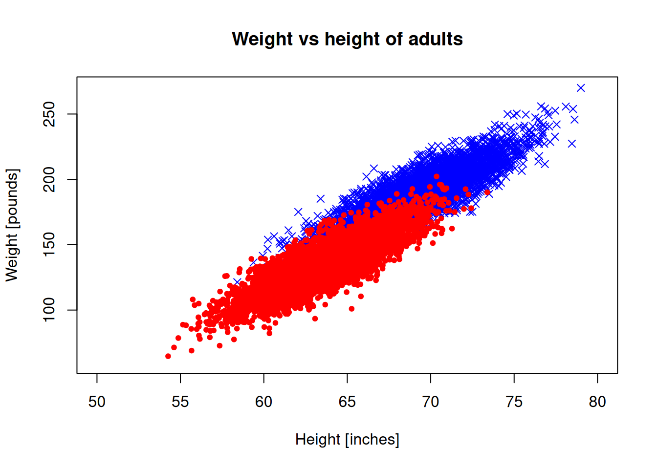
We need a legend to understand which is which:
plot(men_heights, men_weights, pch=4, col="blue",
     xlab = "Height [inches]", ylab="Weight [pounds]",
     xlim = c(50,80), ylim = c(60,270))
points(women_heights, women_weights, pch=20, col="red")
title("Weight vs height of adults")
legend("bottomright", c("Men","Women"),
       col=c("blue","red"),
       pch=c(4,20), inset=0.05, cex=0.75)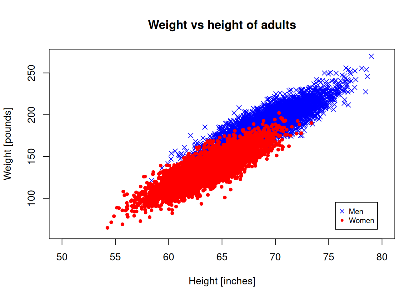
Histograms
If we want to see how the data is distributed, we can generate a histogram.
hist(men_heights)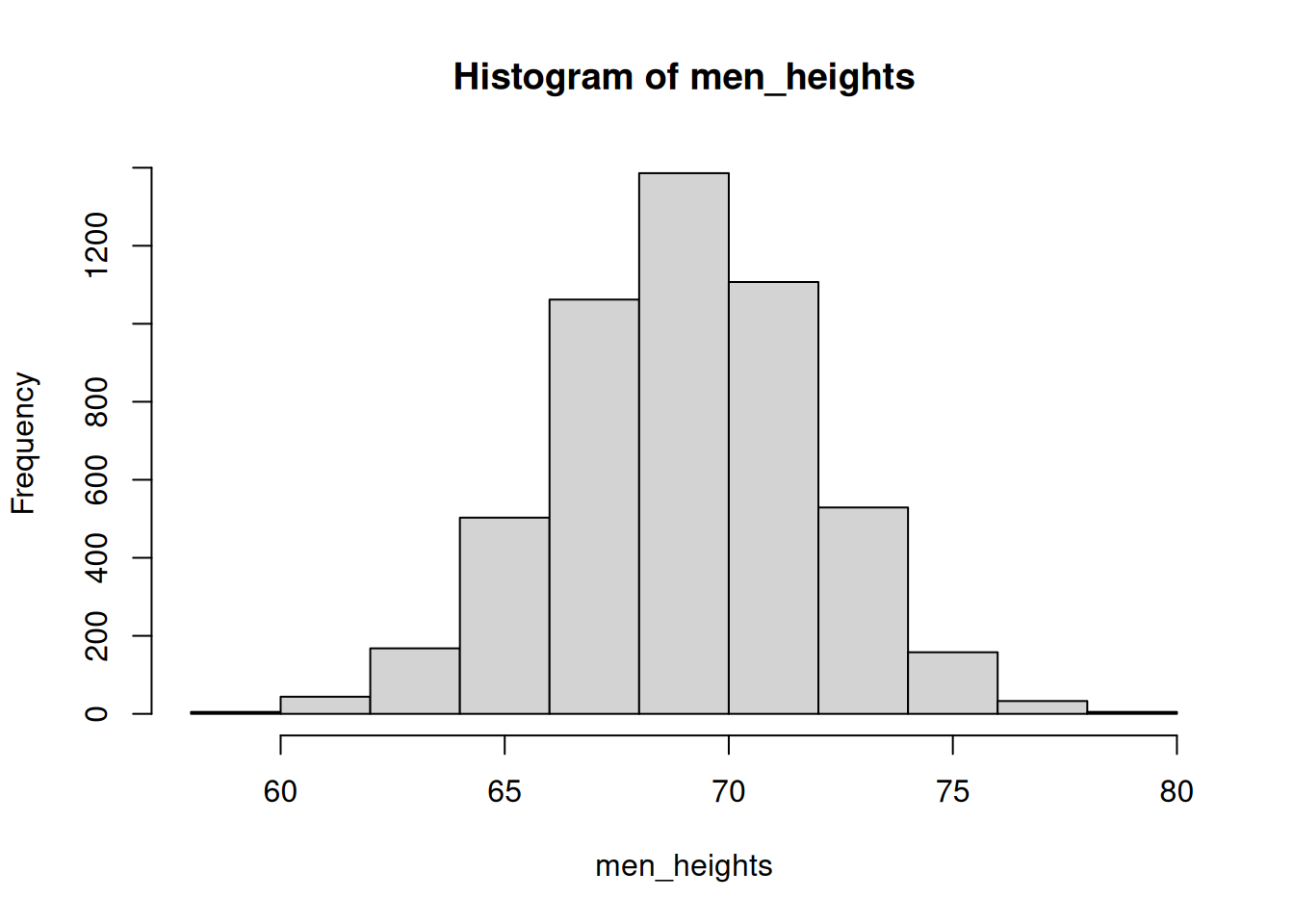
Increase the number of bins to 20 and use relative frequencies, not total counts.
hist(men_heights, breaks=20, freq = FALSE)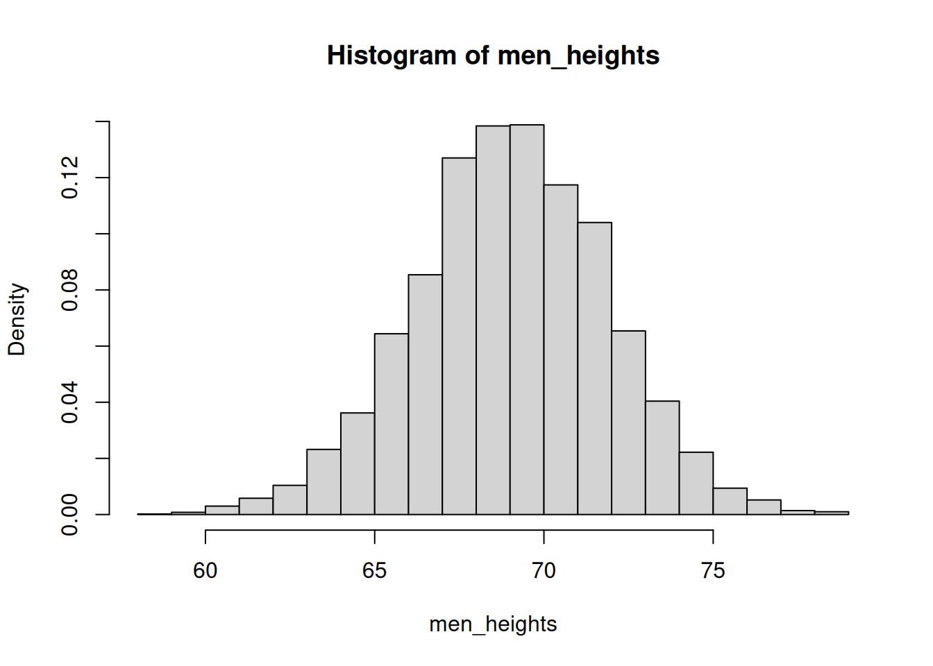
Let’s show both genders, and use color to differentiate: Use the rgb() function whose 4th parameter gives the transparency of the color:
hist(men_heights, breaks=20, freq = FALSE, col=rgb(0,0,1,0.5))
hist(women_heights, breaks=20, freq = FALSE, add=TRUE, col=rgb(1,0,0,0.5))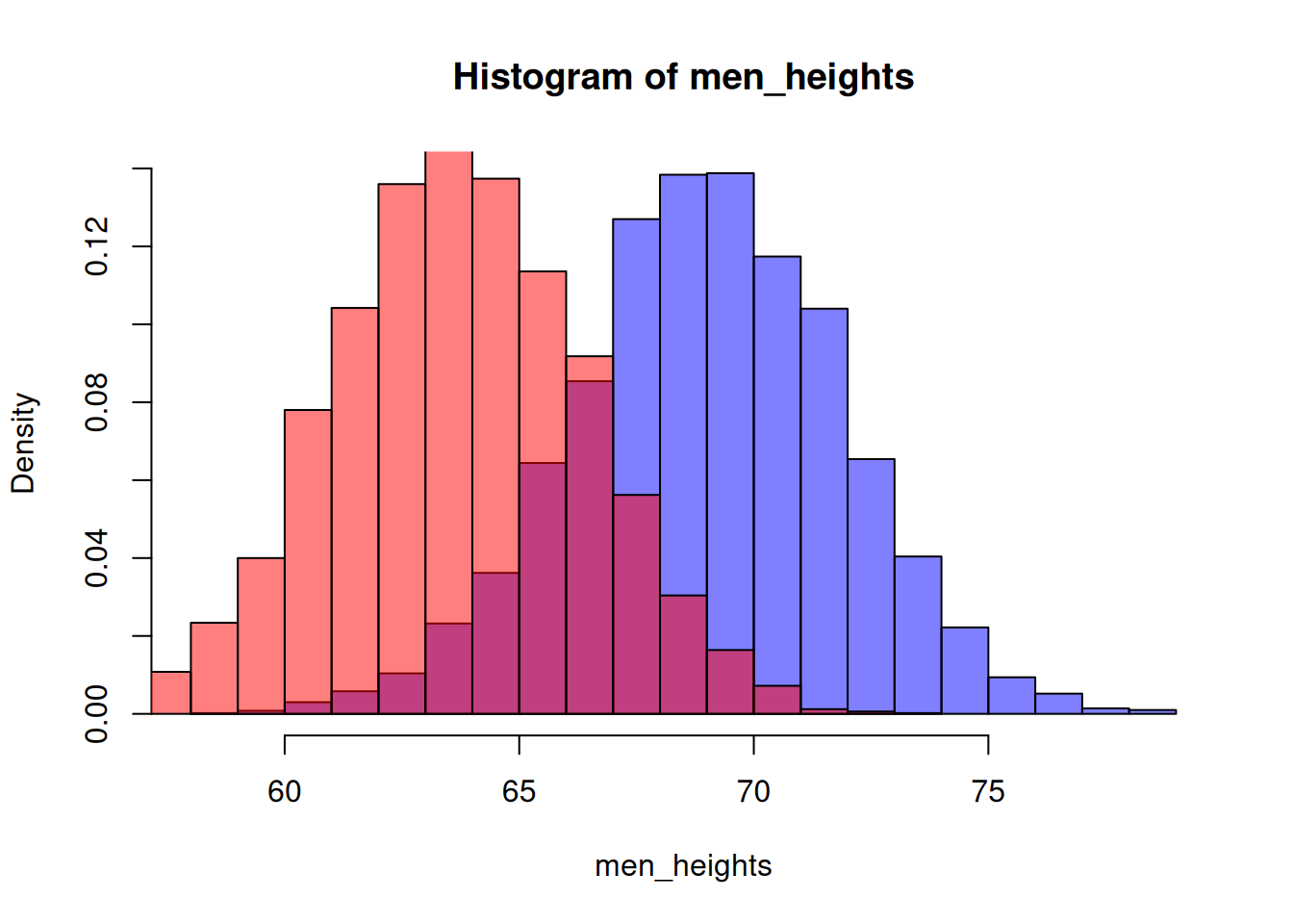
Fix the title and the x-label of the plot.
hist(men_heights, breaks=20, freq = FALSE, col=rgb(0,0,1,0.5),
     main="Male and female heights", xlab = "Height [inches]", xlim=c(50,80), ylim=c(0,0.15))
hist(women_heights, breaks=20, freq = FALSE, col=rgb(1,0,0,0.5), add=T)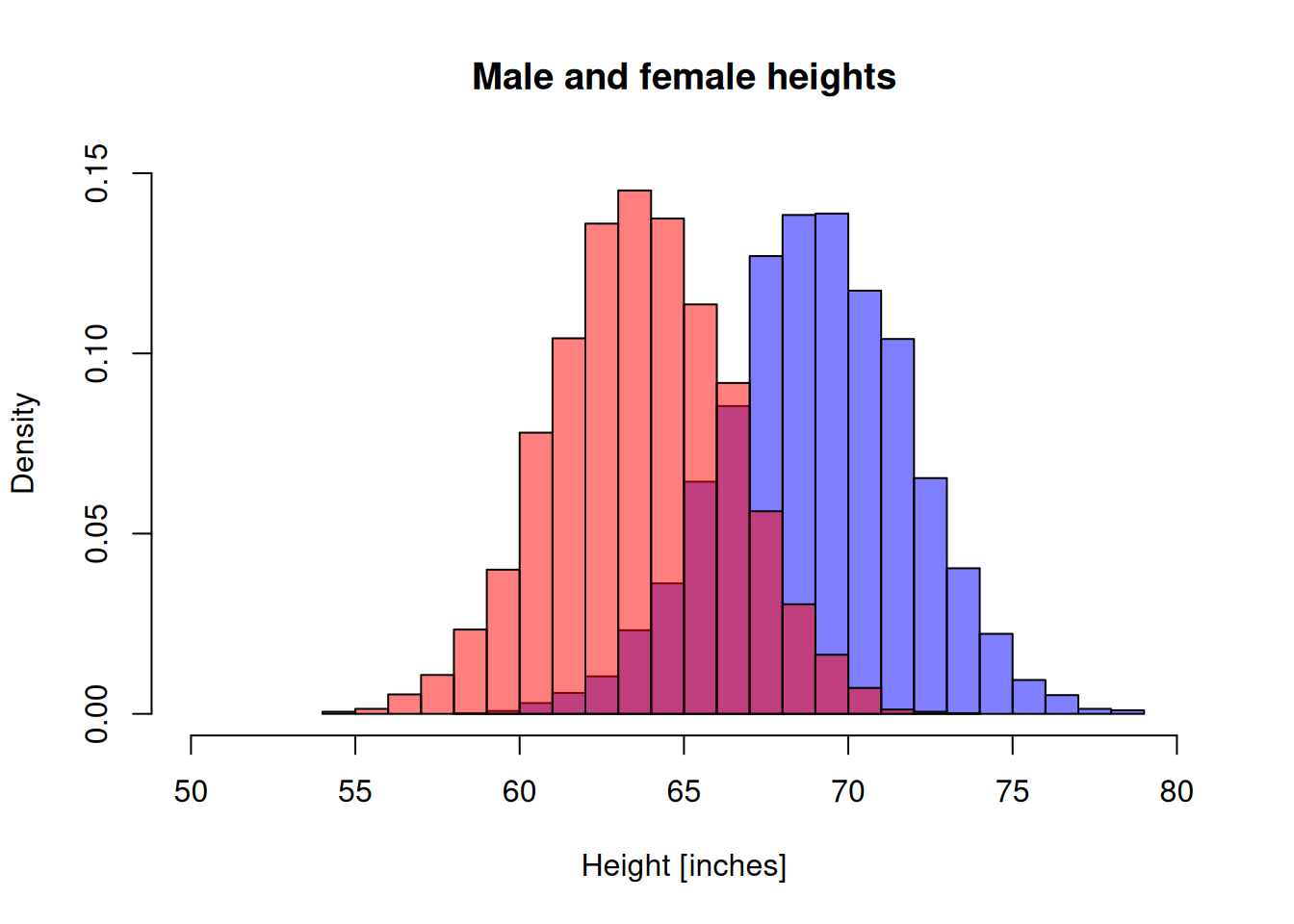
Density plots
R can estimate distribution as a smooth curve, which might look better than a histogram. Plot the male and female heights with lines of thickness 2.
d1 <- density(men_heights)
d2 <- density(women_heights)
plot(d1, main="", xlab="", col="blue", lwd=2)
lines(d2, col="red", lwd=3)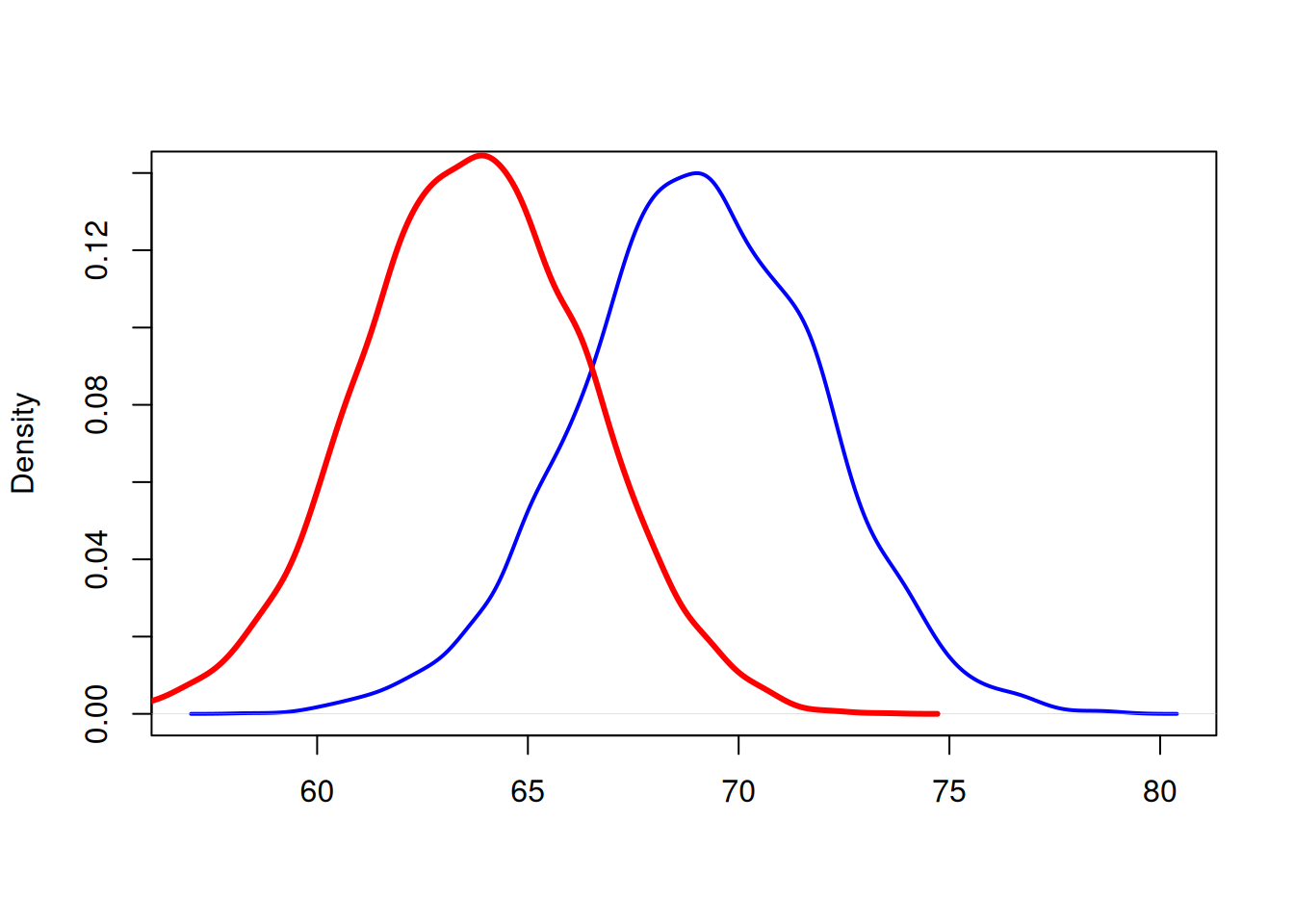
Let’s fix the plot limits and add a text label to mark the curves.
d1 <- density(men_heights)
d2 <- density(women_heights)
plot(d1, main="Height distribution", xlab="Height [inches]",
     col="blue", lwd=2, xlim = c(50,80))
lines(d2, col="red", lwd=2)
text(59, 0.12, "Women", col="red")
text(72, 0.12, "Men", col="blue")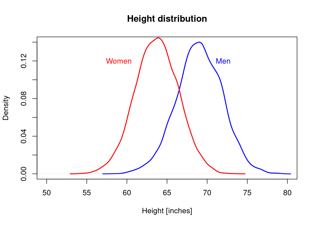
Line plots
Let’s use the built-in EuStockMarkets data set to illustrate line plots.
head(EuStockMarkets) DAX SMI CAC FTSE
[1,] 1628.75 1678.1 1772.8 2443.6
[2,] 1613.63 1688.5 1750.5 2460.2
[3,] 1606.51 1678.6 1718.0 2448.2
[4,] 1621.04 1684.1 1708.1 2470.4
[5,] 1618.16 1686.6 1723.1 2484.7
[6,] 1610.61 1671.6 1714.3 2466.8This is a time series object. Let’s convert it to a data frame:
eustock <- as.data.frame(EuStockMarkets)Plot the stocks DAX with lines.
plot(eustock$DAX, type="l")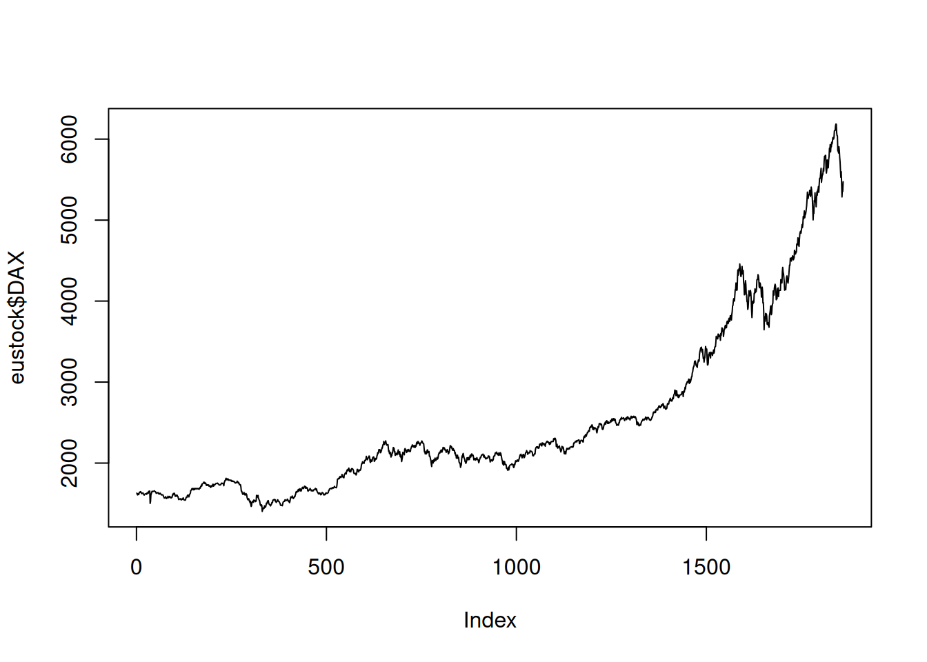
Plot DAX with a thick red line.
plot(eustock$DAX, type="l", col="red", lwd=3)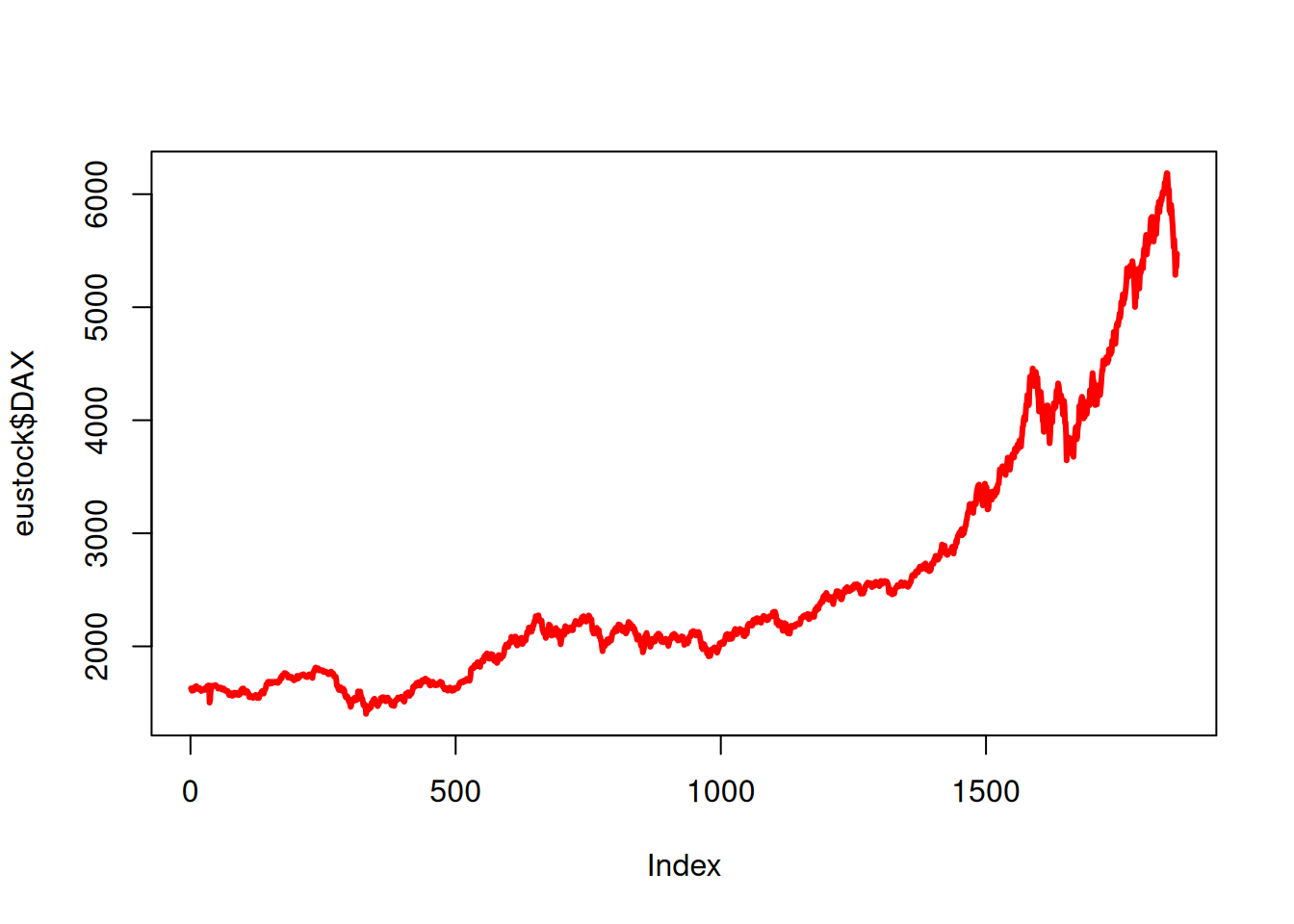
Plot DAX and SMI together:
plot(eustock$DAX, type="l", col="red")
lines(eustock$SMI, col="green")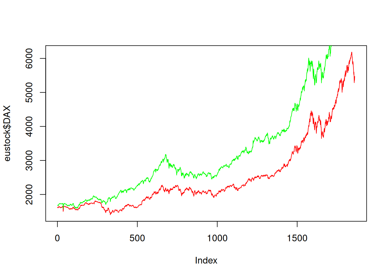
Let’s plot all the stocks on the same plot:
nstocks <- length(names(eustock))
colors <- rainbow(nstocks)
plot(eustock[[1]], type="l", col=colors[1], xlab="Business days", ylab="Stock value")
for(i in 2:nstocks ){
    lines(eustock[[i]], col=colors[i])
    }
legend("topleft", names(eustock), col=colors, lty=rep(1,nstocks), inset=0.05)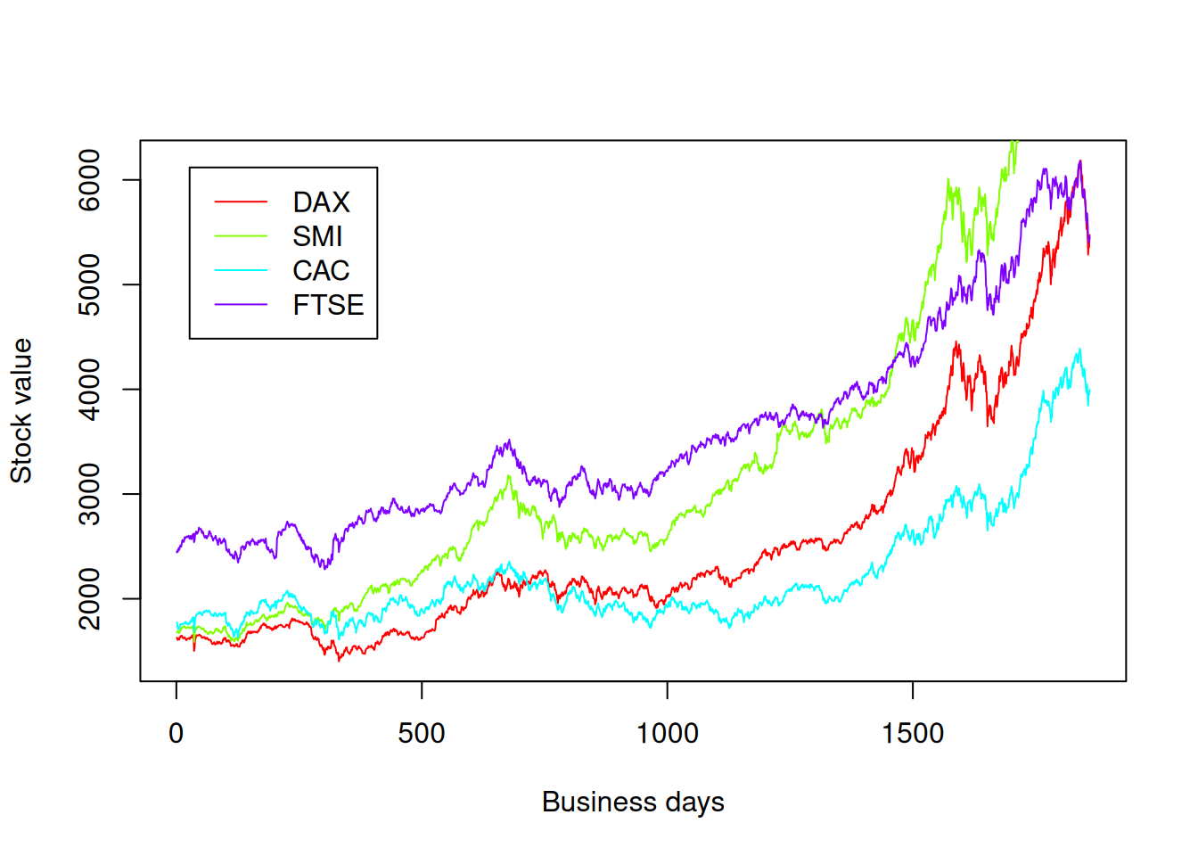
Dot, bar, and pie charts
dotchart(mtcars$mpg,
         labels=row.names(mtcars),cex=.7,
         main="Gas Mileage for Car Models",
         xlab="Miles Per Gallon")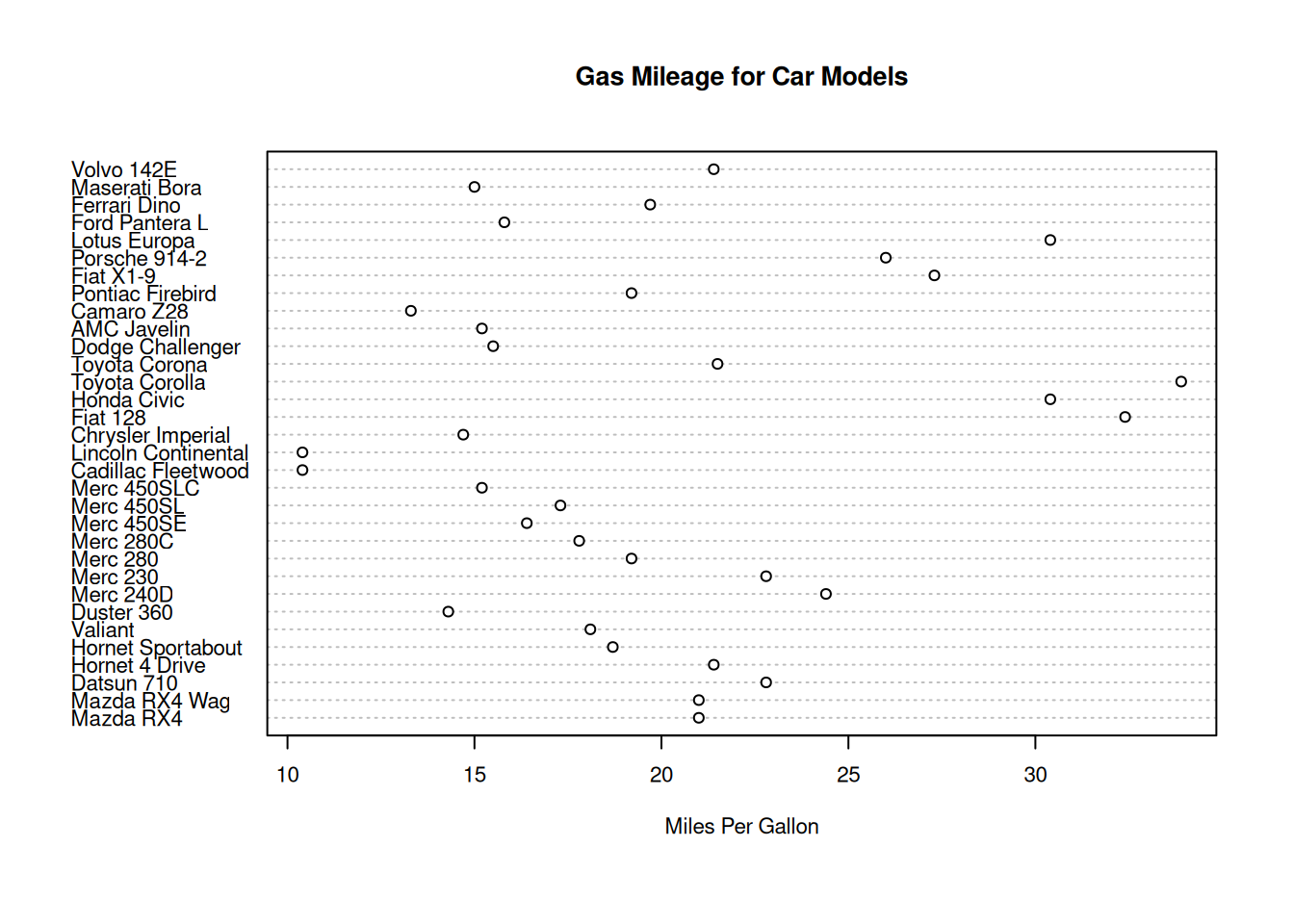
table(mtcars$cyl)
 4  6  8
11 7 14 barplot(table(mtcars$cyl), main="Cylinder distribution", xlab = "Cylinders")
counts <- table(mtcars$cyl)
barplot(counts, main="Cylinder Distribution", horiz=TRUE,
  names.arg=c("4 cyl", "6 cyl", "8 cyl"))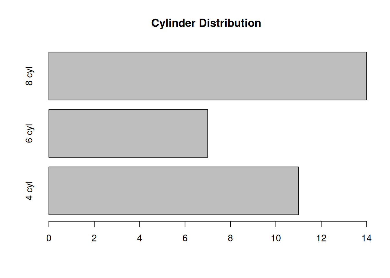
pie(counts, labels=c("4 cyl", "6 cyl", "8 cyl"),
    col = rainbow(length(counts)),
    main = "Cylinder distribution")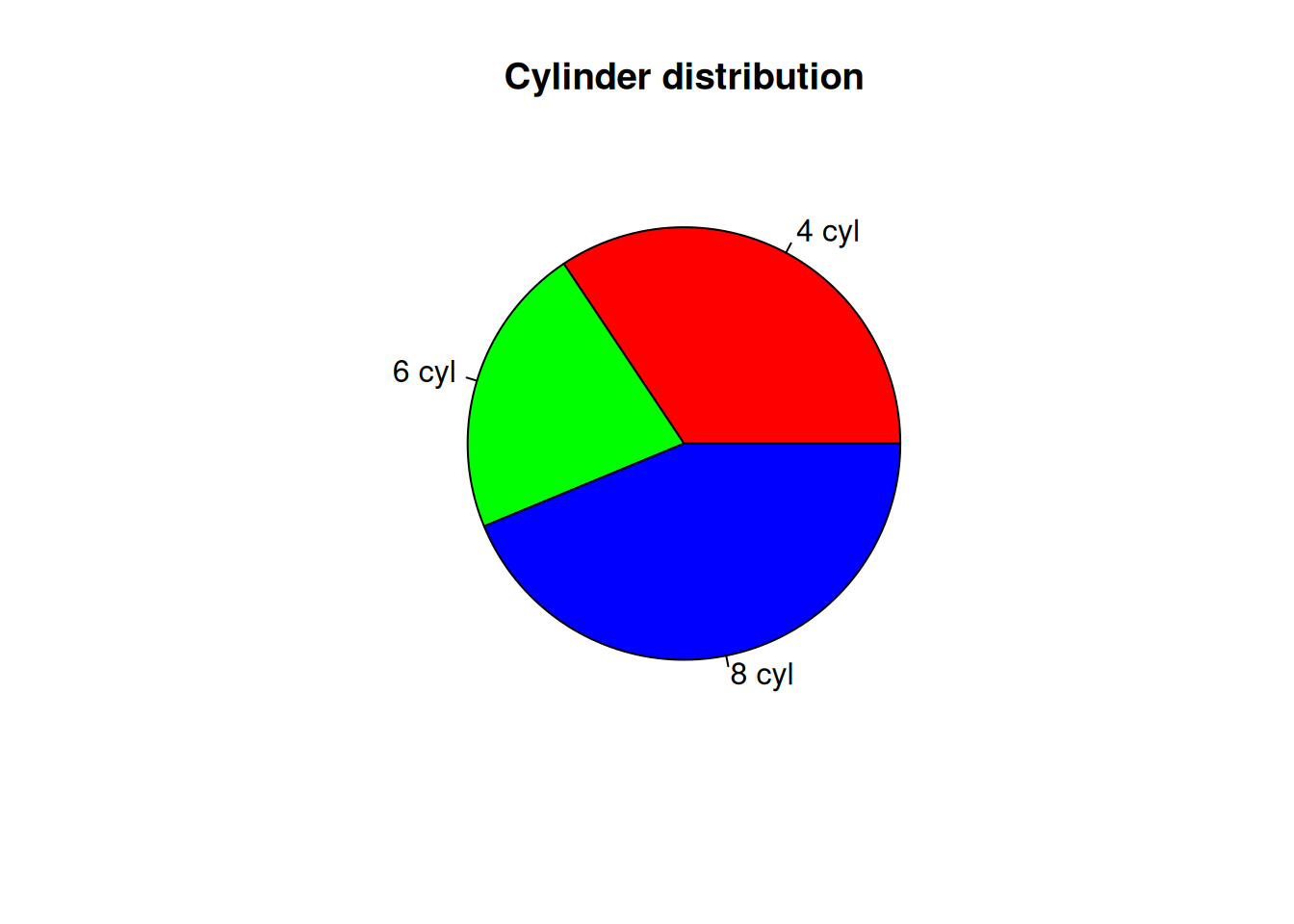
Figure arrays
Sometimes we want several plots in one figure. We can achieve this with the par() function.
options(repr.plot.width=6, repr.plot.height=4)
normal1 <- rnorm(1000)
par(mfrow=c(1,2))
plot(normal1)
hist(normal1)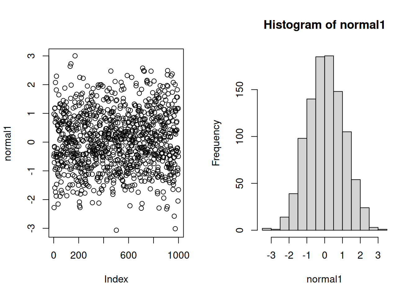
Here mfrow=c(1,2) specifies that the plots should be arranged as one row and two columns, and placement of figures should go by rows.
Alternatively, mfcol argument would force placement by columns. In this particular example, it gives an identical result.
Generate normally-distributed random numbers with twice the standard deviation and compare the plots.
options(repr.plot.width=8,repr.plot.height=8)
normal2 <- rnorm(1000, sd = 2)
par(mfrow=c(2,2))
plot(normal1)
hist(normal1)
plot(normal2)
hist(normal2)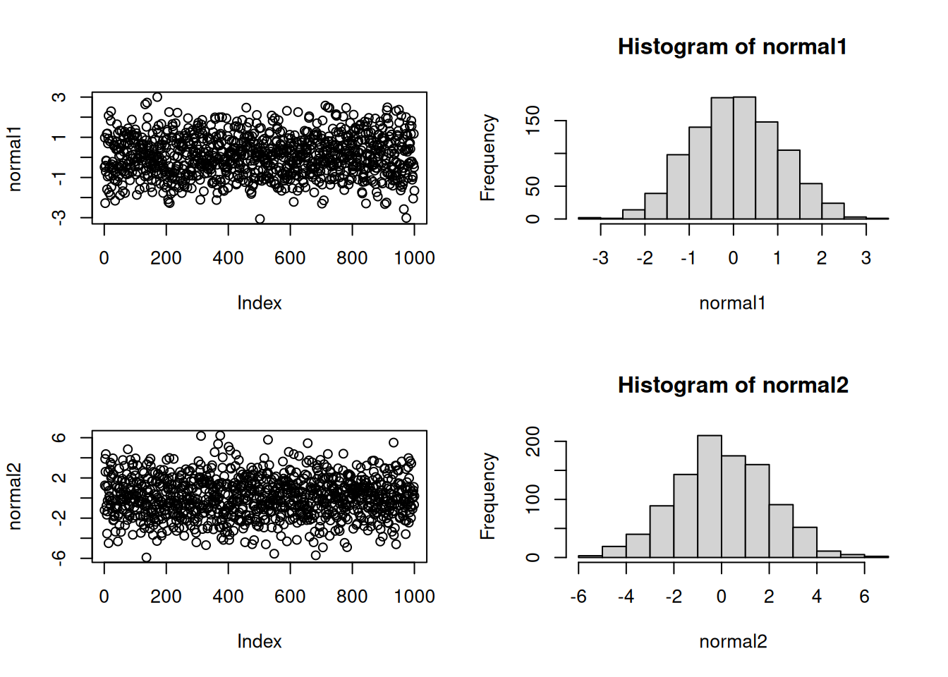
Match the axis scales for better comparison.
par(mfrow=c(2,2))
plot(normal1, ylim = c(-6,6), pch=4, col="blue")
hist(normal1, xlim = c(-6,6), col="red")
plot(normal2, ylim = c(-6,6), pch=4, col="blue")
hist(normal2, xlim = c(-6,6), col="red")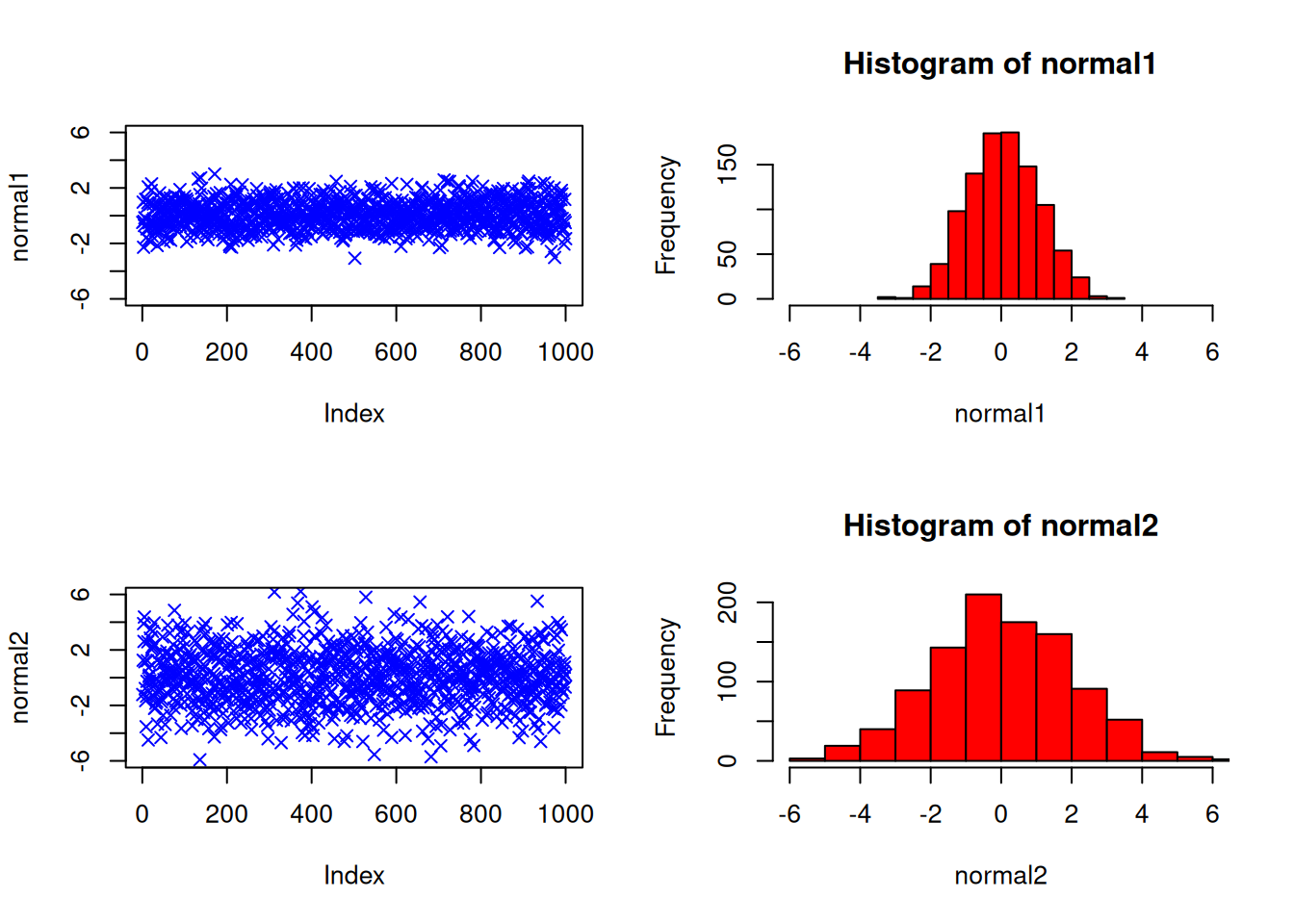
Parametric plots
options(repr.plot.width=8,repr.plot.height=6)
t <- seq(0, 2*pi, length.out = 200)
par(mfrow=c(2,3))
plot(cos(t), sin(2*t), type="l")
plot(cos(3*t), sin(2*t), type="l")
plot(cos(3*t), sin(4*t), type="l")
plot(cos(5*t), sin(4*t), type="l")
plot(cos(5*t), sin(6*t), type="l")
plot(cos(9*t), sin(8*t), type="l")
Box plots
A box-and-whisker plot provides a graphical summary of the distribution of data points.
randnums <- rnorm(1000)
summary(randnums)
Min. 1st Qu. Median Mean 3rd Qu. Max.
-3.97199 -0.75212 -0.05388 -0.07030 0.57818 2.80446 The boxplot is a visual summary of the data:
options(repr.plot.width=3,repr.plot.height=5)
boxplot(randnums)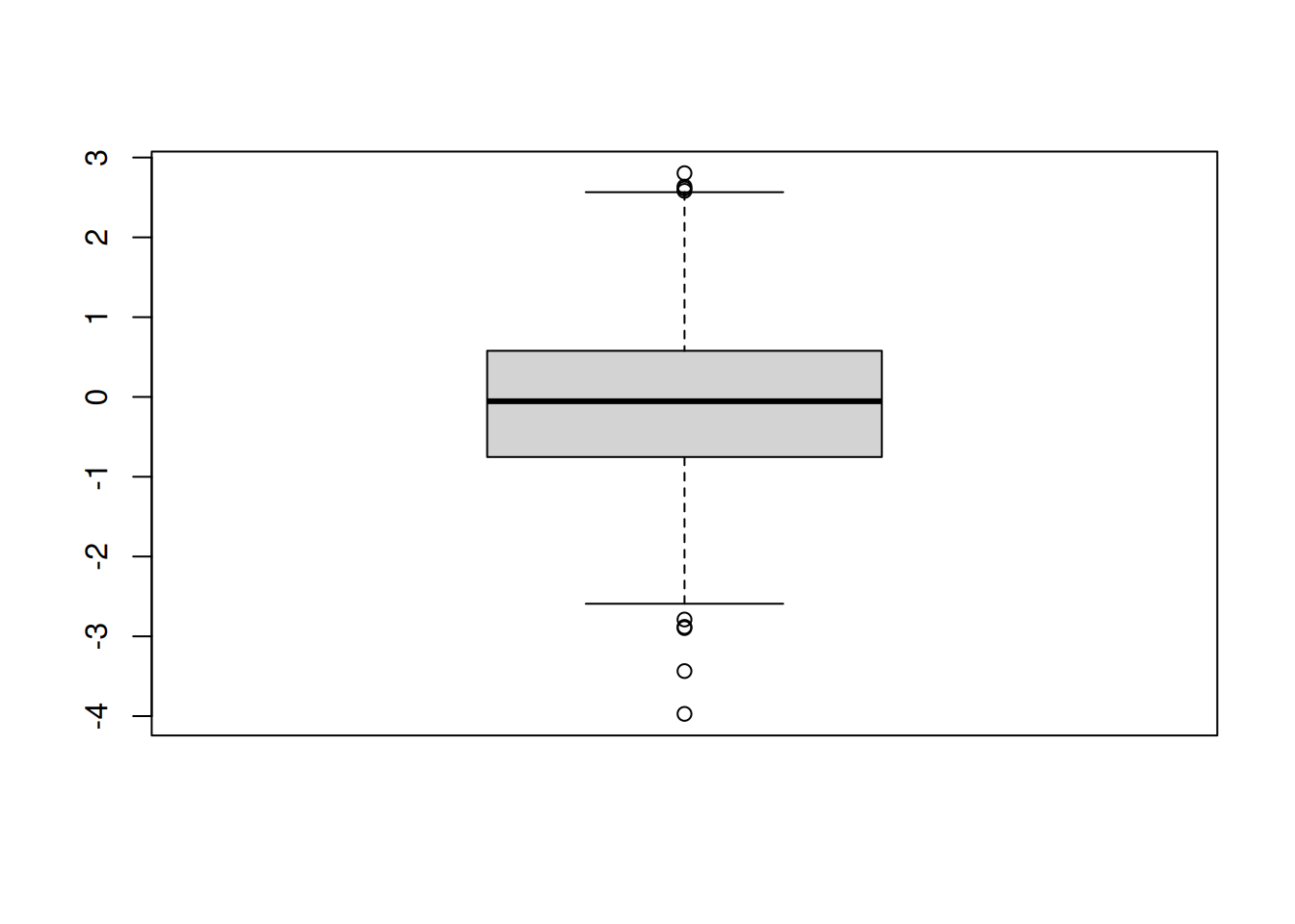
If you prefer to plot it sideways:
options(repr.plot.width=6,repr.plot.height=3)
boxplot(randnums,horizontal = TRUE)
title("Normally distributed random numbers")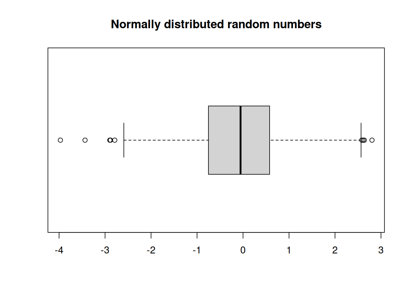
- The lines in the box indicate the first quartile, the median, and the third quartile. The length of the box is the interquartile range.
- The lines (whiskers) extend to the observations that are within a distance of 1.5 times the box length.
- Any other points farther out are considered outliers, and shown separately.
Boxplots of two or more distributions could be displayed side-by-side using par() function, but it is more informative to show them on a common set of axes.
randnums2 <- rnorm(1000, sd=2)
options(repr.plot.width=6,repr.plot.height=3)
boxplot(randnums, randnums2, horizontal = TRUE)
title("Normally distributed random numbers")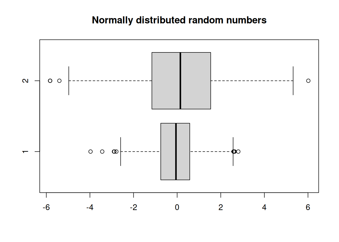
Let’s draw boxplots on the mtcars data set.
boxplot(mtcars$mpg, mtcars$hp, mtcars$wt)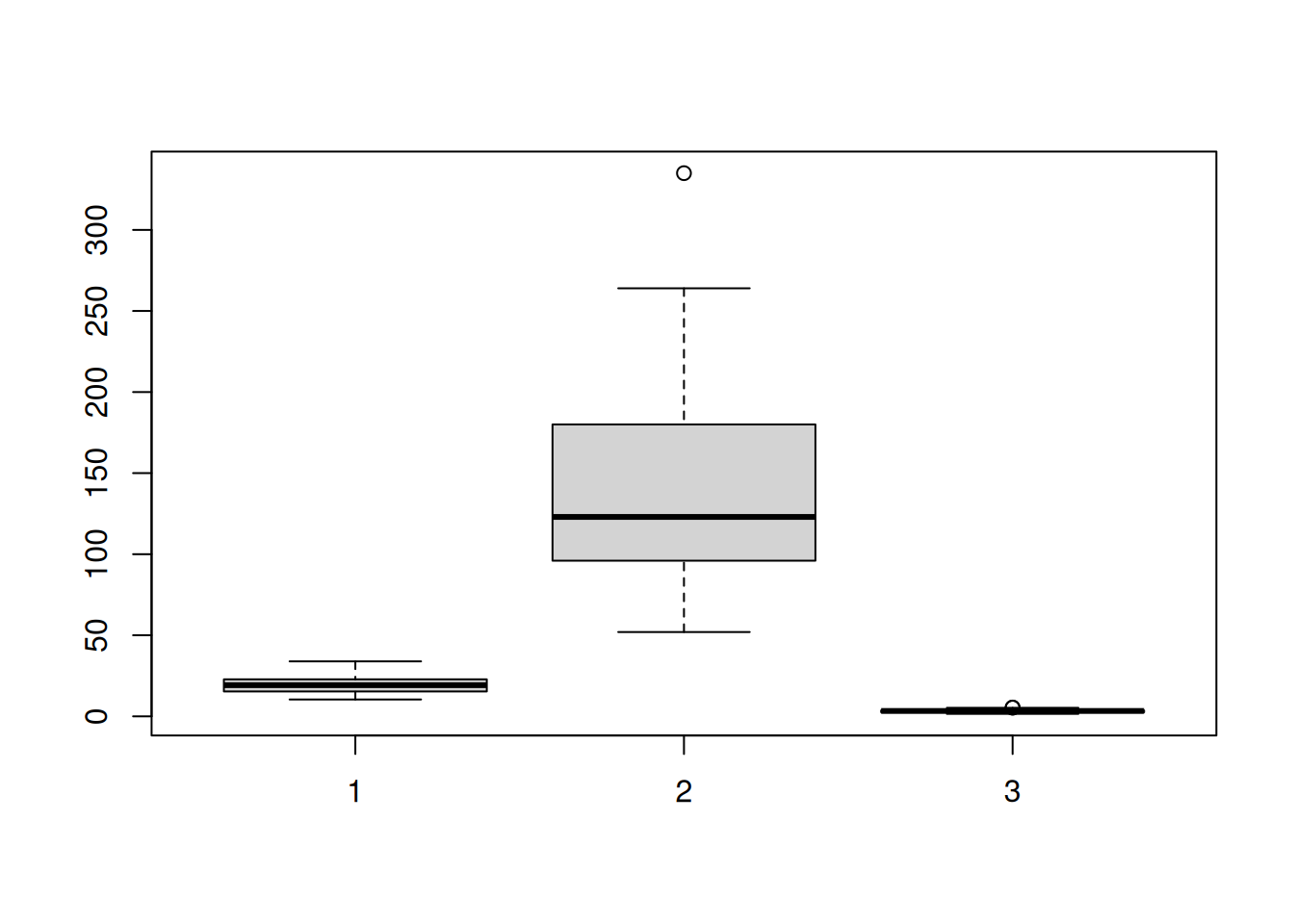
The scales vary too much. It is better in this case to plot them on separate axes.
par(mfrow = c(1,3))
boxplot(mtcars$mpg)
title("mpg")
boxplot(mtcars$hp)
title("hp")
boxplot(mtcars$wt)
title("wt")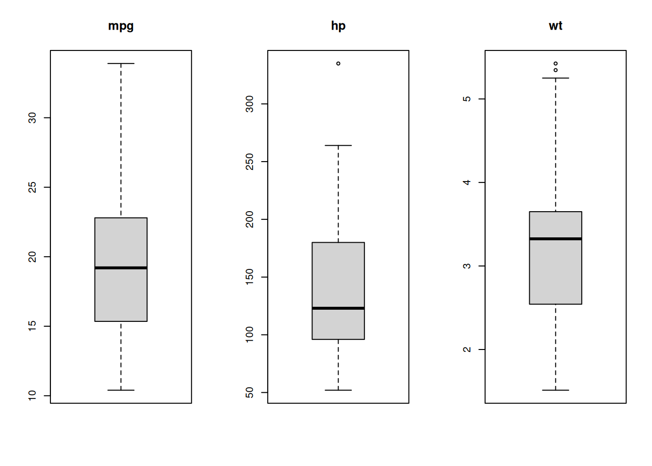
Strip charts
A strip chart is a one-dimensional scatter plot of some data. It helps us to see distributions of data points.
randnums1 <- rnorm(100)
randnums2 <- rnorm(100,mean=1,sd=0.5)
stripchart(list(randnums1, randnums2))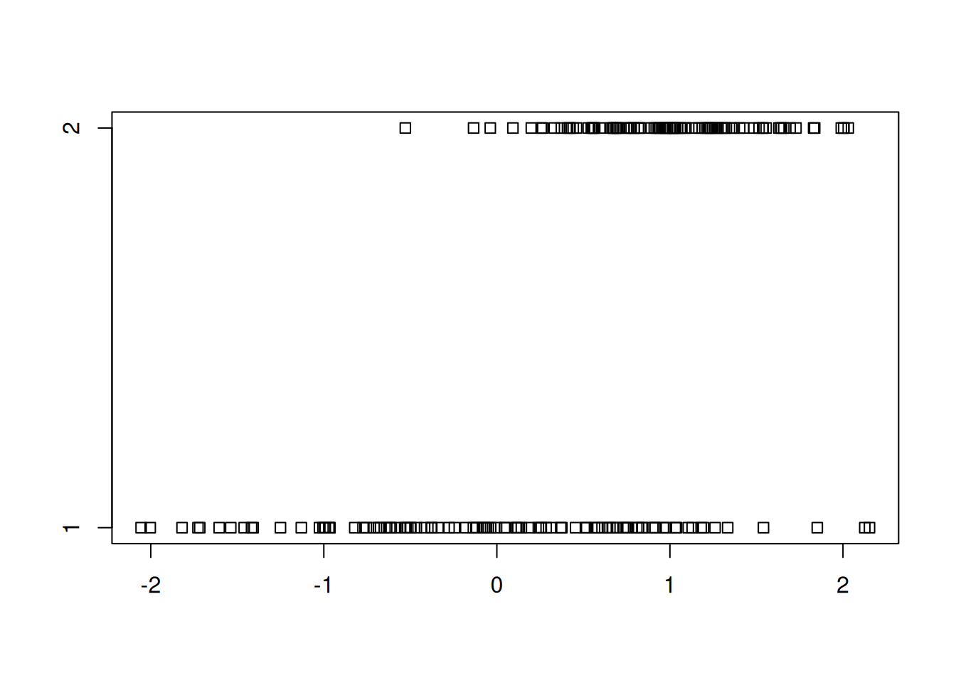
To avoid the overlap of points, we can introduce some “jitter”.
stripchart(list(randnums1, randnums2), method="jitter", group.names = c("data 1","data 2"))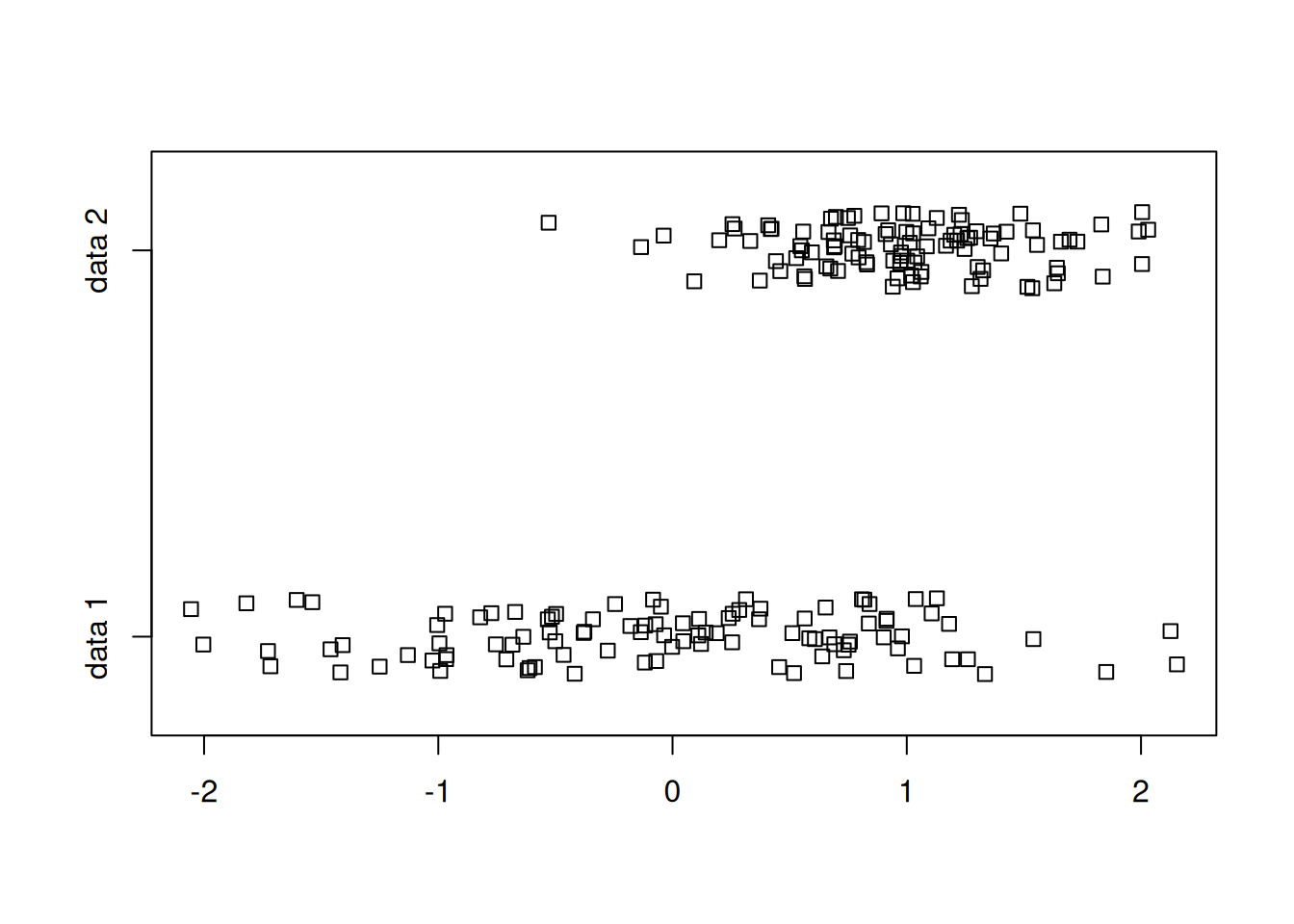
Some embellishments:
stripchart(list(randnums1, randnums2), method="jitter",
           group.names = c("data 1","data 2"),
          col=c("red","darkblue"), pch=4)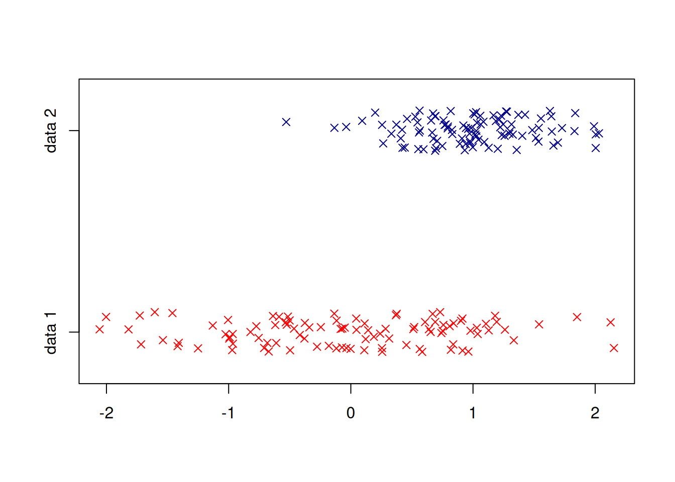
Exporting graphics
We frequently need to save our plot in various graphics formats so that we can put them in reports, papers or web pages. R can export graphics to many formats, including JPEG, PNG, TIFF, SVG, PDF, PS, BMP, WMF.
For example, here are the steps to create a PNG file
- Call the
png()function with the file name as argument. - Give the plotting commands. They will not produce a visible plot now.
- When done, call the function
dev.off(). Very important, otherwise you will get a corrupted file.
options(repr.plot.width=4,repr.plot.height=4)

plot(x = mtcars$wt, y = mtcars$mpg,
     pch = 16, frame = FALSE,
     xlab = "wt", ylab = "mpg", col = "#2E9FDF")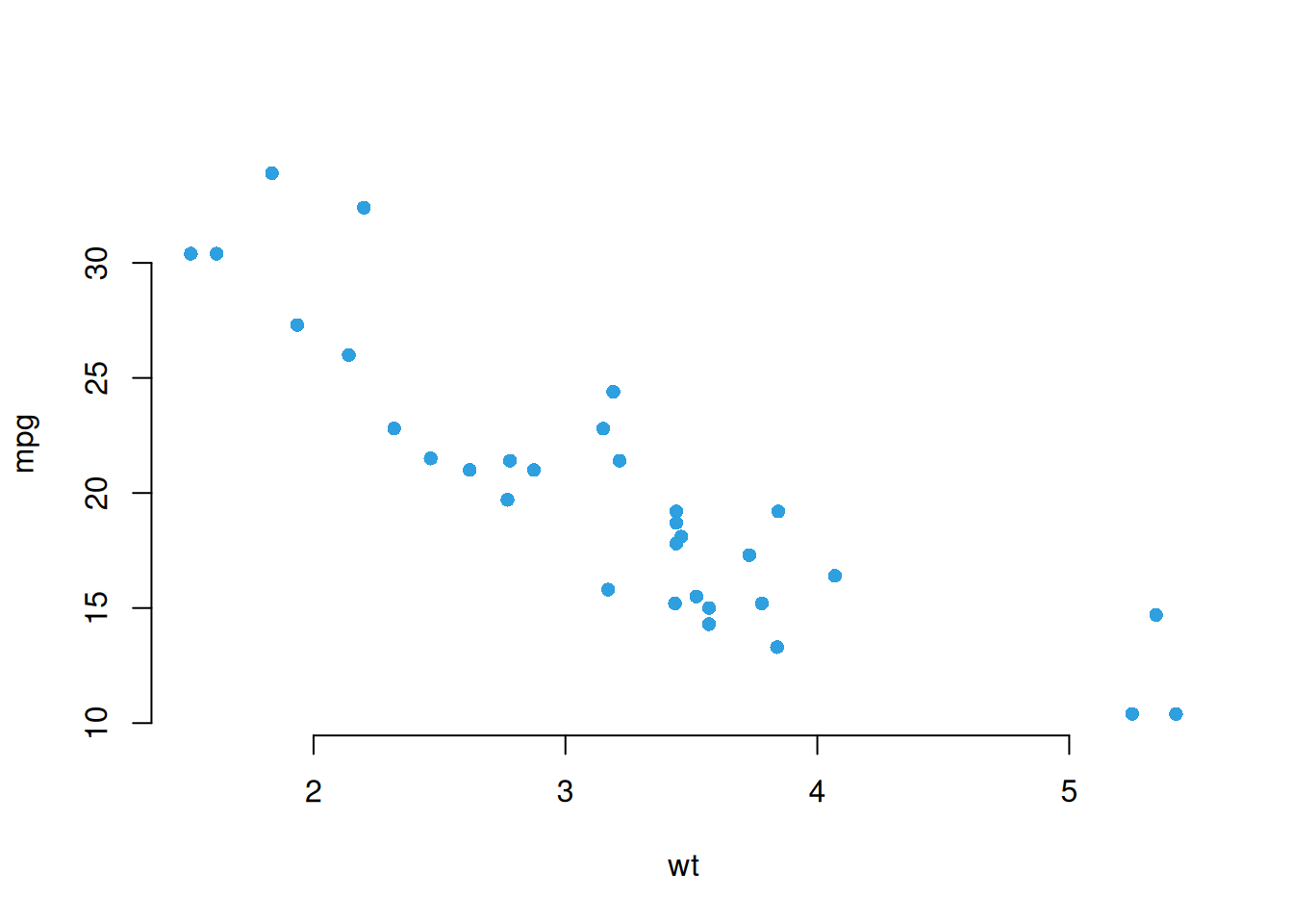
Export to a PNG file using the png() function.
png("cars.png")  # open the PNG file.
 Plotting commands
plot(x = mtcars$wt, y = mtcars$mpg,
     pch = 16, frame = FALSE,
     xlab = "wt", ylab = "mpg", col = "#2E9FDF")
 finalize the export to png
dev.off()
Note: If you are using RStudio, this can be achieved from the Plots->Export->Save menu.
To export to a PDF file, just change the first line:
pdf("cars.pdf")
plot(x = mtcars$wt, y = mtcars$mpg,
     pch = 16, frame = FALSE,
     xlab = "wt", ylab = "mpg", col = "#2E9FDF")
dev.off()
The plotting functions allow for many customizations, depending on the file format. One common customization is the size of the plot. Let’s recreate the PNG file with a different size.
png("cars2.png", width = 200, height = 300)
plot(x = mtcars$wt, y = mtcars$mpg,
     pch = 16, frame = FALSE,
     xlab = "wt", ylab = "mpg", col = "#2E9FDF")
dev.off()